The Benner Cycle: Time to panic or on a high?
Sure thing
In 1875, an Ohio farmer Samuel Benner published this diagram in his book ‘Benners Prophecies future ups and downs in prices’.
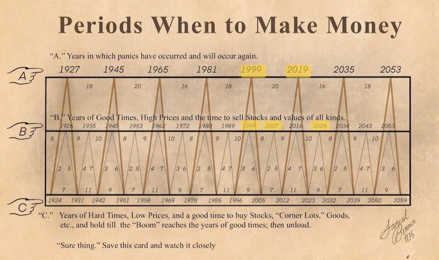
The diagram marks extreme years in 3 categories from top to bottom.
- Panics
- Good times high prices
- Hard times low prices
The stock market: 150 years later
A successful farmer from Ohio. Having suffered severe losses in the market panic of 1873, he set out to study market cycles to find a way to prepare for the future. It is interesting that some predicted dates appear relevant, even though this was designed for a different market.
Significant years that stand out in this diagram:
Panics
| benner year | name | recession years |
|---|---|---|
| 1927 | Great depression | 1929 |
| 1981 | Energy crisis recession | 1981-1982 |
| 1999 | Dot-com bubble | 2000 |
| 2019 | COVID-19 lockdowns | 2020 |
High prices
| benner year | name | recession years | dates |
|---|---|---|---|
| 1972 | 1973–1974 stock market crash | 1973-1974 | Jan 1973 |
| 1980 | Early 1980s recession | 1980 | Nov 1980 |
| 1989 | Early 1990s recession | 1990 | Aug 1990 |
| 1999 | Dot-com bubble | 2000 | Mar 2000 |
| 2007 | 2008 financial crisis | 2007-2009 | Oct 2007, Sep 2008 |
| 2016 | Market turbulence (China, EU) | 2015-2016 | Jun 2015 |
| 2026 |
Digging deeper
Let’s look closed into the high prices cycle as 2026 is a marked peak.
The data used is ^GSPC from yahoo finance (SP500 index).
We aggregate weekly data in compiling the charts.
| symbol | resolution | min | max | count |
|---|---|---|---|---|
| ^GSPC | 1wk | 1927-12-26 | 2026-02-02 | 5119 |
The cycle spans 27 years.
The Y axis shows the average change in price for forward returns. The X axis shows the cycle position for the year from 0 to 26.
Benner marked peaks at 8, 9 and 10 years within the 27-year cycle. The red highlights show these areas.
The fourth vertical bar represents the chart wrapping back around to zero.

There seems to be some gradual increase in momentum before high years. After which momentum drops off.
We can see which years had an immediate drop from this chart comparing high to post high years.

High years were followed by low years since 1970.
The 2016 high year was followed by new highs. However, a correction had already occurred around June 2015. The US markets were not severely affected however there was a larger correction in the Chinese market.
The years surrounding the great depression of the 1930’s are hit-and-miss.
Overall wouldn’t use it as a predictor of a specific year when we are likely to see a crash; but it captures some cyclical movements quite well.
Source code
Don’t take my word for it. To see the source code, open the Jupyter notebook here on github.